What Colour Splashback Goes With a Grey Kitchen? 10 Options That Work
- Jun 9
- 5 min read
Grey kitchens are everywhere, and for good reason. Grey works with almost any cabinetry style, hides everyday marks better than white, and gives you room to play with colour elsewhere in the kitchen. The splashback is the easiest place to do that.
We're kitchen fitters in Northamptonshire and we've fitted dozens of grey kitchens with very different splashback choices. Here are ten splashback colours that work, from the safe classics to the bolder options, with notes on which kind of grey each one suits best.
Before you choose: what kind of grey is your kitchen?
The shade and undertone of your grey kitchen narrow down the splashback options. Three things to know about your kitchen first:
Light, mid or dark grey? Lighter greys (dove, pebble, ash) take well to almost any splashback. Darker greys (anthracite, charcoal, slate) usually need a lighter or more reflective splashback unless the kitchen has plenty of natural light.
Warm or cool undertone? Warm greys lean towards brown, taupe or yellow. Cool greys lean towards blue or green. Warm greys sit better with warm splashback colours (brass, terracotta, blush). Cool greys take cooler tones (navy, sage, white) more naturally.
Matte, satin or gloss cabinets? Matte cabinets pair well with gloss splashbacks for contrast. Gloss cabinets benefit from matte or textured splashbacks to avoid the kitchen feeling too shiny overall.
Now the options.

1. White
The safest and most common choice. White lifts the kitchen, makes it feel bigger and brighter, and works with any shade or undertone of grey. Good in small or low-light kitchens. The downside is that it can feel slightly underwhelming if the grey cabinetry is already understated, in which case a brighter accent is worth considering.
Best for: small kitchens, light grey cabinets, period properties.

2. Black or charcoal
A dramatic, high-contrast option. Black splashbacks pair best with mid to light grey cabinets, because going dark on both swallows the space. Looks particularly good in glossy glass or a matte porcelain tile. The kitchen will need plenty of light (natural or under-cabinet) to stop it feeling closed in.
Best for: light grey cabinets, large kitchens with good natural light, modern or industrial styles.
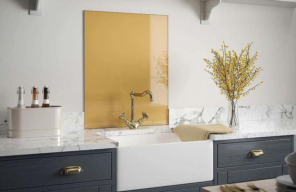
3. Brass or warm metallic
A coloured metallic splashback (brushed brass, antique gold, copper) adds warmth without committing to a strong colour. The reflective surface bounces light around, and the warm tone softens cool grey cabinetry. Pricier than glass or tile, but a small splashback area can stretch a modest budget.
Best for: warm grey cabinets, premium kitchens, kitchens that need warming up.

4. Mirror or reflective glass
A mirrored splashback maximises light and visually doubles the depth of the kitchen. Useful in narrow galley layouts or kitchens with limited windows. The downside is that fingerprints and water marks show easily. Partial-mirror or smoked-mirror finishes look more forgiving than a clear silver mirror.
Best for: small, narrow or low-light kitchens, modern styles.

5. Soft pink or blush
A warm, on-trend choice that softens a cool grey kitchen without overpowering it. Blush works particularly well as a glass splashback or smaller mosaic tile, and pairs nicely with brass or copper fittings. Less risky than it sounds. Most blush tones read as a warm neutral once installed.
Best for: cool grey cabinets, contemporary kitchens, kitchens lacking warmth.

6. Sage green or olive
The other on-trend pairing for grey kitchens. Sage adds natural warmth and works with both warm and cool greys. Look for muted, dusty sage tones rather than vivid greens. A textured tile (zellige, fluted ceramic) reads more sophisticated than a flat painted surface or solid glass panel.
Best for: shaker-style grey kitchens, country-feel kitchens, period properties.

7. Navy or deep blue
A bold but classic choice. Navy with grey works particularly well in shaker kitchens, where the depth of the splashback colour matches the formality of the cabinet style. Avoid going too dark in small spaces. Tile, glass and painted plaster all work.
Best for: shaker or traditional grey kitchens, medium-to-large kitchens.

8. Marble or marble-effect
White and grey veined marble (Carrara, Calacatta, or porcelain marble-effect tile) ties a grey kitchen together and adds visual interest without committing to a strong colour. Real marble is high-maintenance as a splashback (acid etching from food and drink), so porcelain look-alikes are usually a more practical choice.
Best for: any shade of grey, premium kitchens, classic or transitional styles.

9. Warm wood or wood-effect tile
A warm timber tone (oak, walnut, smoked oak) sits surprisingly well behind a grey hob. Real timber isn't usually used as a splashback (heat and moisture), but wood-effect porcelain tile gives the same look without the maintenance issues. Particularly good for warming up cool grey kitchens.
Best for: cool grey cabinets, kitchens with limited natural light, Scandinavian or Japandi styles.

10. Patterned or encaustic tiles
A statement option. Moroccan, encaustic or hand-painted patterned tiles give a quiet grey kitchen a focal point. Best used over a small area (behind the hob, for example) rather than across the whole worktop run. Geometric patterns in muted tones work well; busy or high-contrast patterns can fight with the rest of the kitchen.
Best for: small splashback areas, grey kitchens that need more character, period properties.
Coordinating with the rest of the room
The splashback isn't the only colour decision. Wall paint, flooring, worktops and window treatments all contribute. Five quick principles:
Worktops usually anchor the splashback choice. White worktops take any splashback; dark worktops want a lighter splashback for balance; veined worktops want a plain splashback.
Flooring. Pale floors (oak, light tile) let the splashback be bolder. Dark floors generally want a lighter splashback to balance the room.
Wall paint in the rest of the kitchen should pick up either the cabinet grey or one of the splashback tones, not introduce a third unrelated colour.
Window treatments. If you're considering shutter blinds in your kitchen, the shutter colour should match either the cabinet grey or the trim. Picking up the splashback colour in the shutters tends to look forced.
Hardware (taps, handles, light fittings) should ideally match the splashback's metallic tone. Brass splashback with chrome taps doesn't usually land well.
Get a quote for a new kitchen in Northamptonshire
If you're planning a kitchen in Kettering or anywhere else in Northamptonshire and want help pulling the colour scheme together, speak to our team. We design and fit kitchens with the whole room in mind, not just the cabinets. Finance is available through Phoenix Financial Consultants if you'd rather spread the cost.


Comments